A Custom Fediverse Frontend
Published December 16, 2024
Chris Hayes
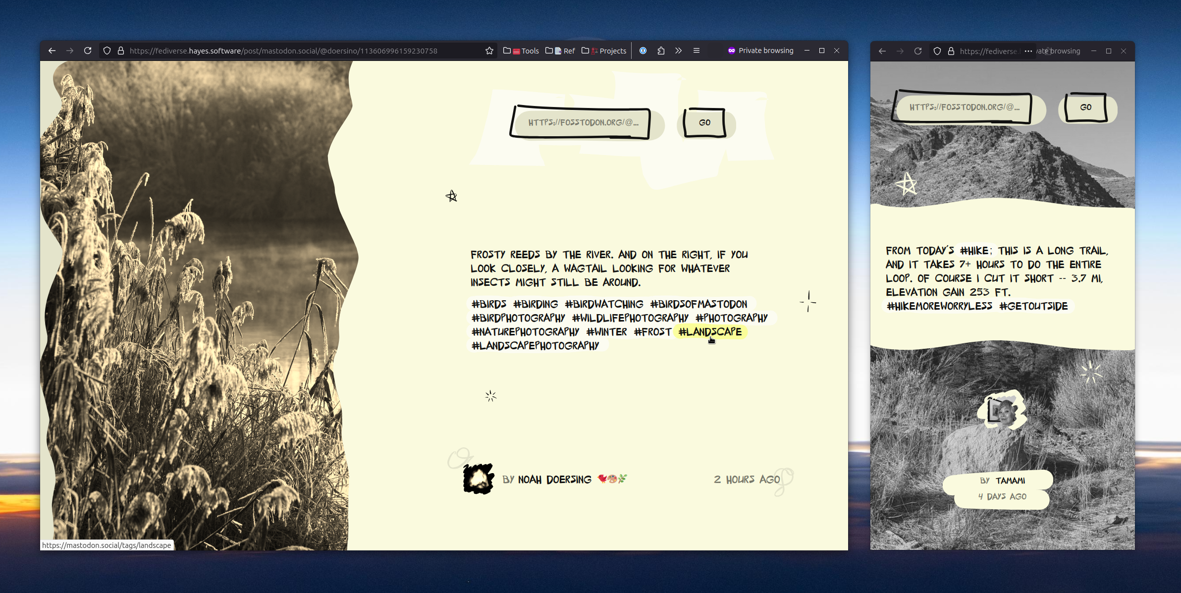

**The app UI** one in desktop format, one in mobile format. The design is very yellow and sepia-ish showing a toot and an image next to it. A lot of brush and marker strokes are incorporated into the design. Otherwise the design is minimal. **The app UI** one in desktop format, one in mobile format. The design is very yellow and sepia-ish showing a toot and an image next to it. A lot of brush and marker strokes are incorporated into the design. Otherwise the design is minimal.

Why Build a Fediverse Reader?
I wanted to learn how to consume Mastodon content in a “read-only” way—no posting, boosting, or liking, just viewing.
Enter Fedify. I started with a minimal Next.js example that taps into Fedify and ActivityPub.
Initially planned as a boilerplate for other developers, but as I explored, the design aspect drew me in.
The Approach
This project queries a Mastodon post by URL and displays it on a custom page.
It’s lightweight, focusing only on reading content without handling interactions.
While the main feature is simple—show a single Mastodon post—styling and layout posed the real challenge.
I aimed for a consistent, fun appearance, battling messy floating shapes and SVG elements. The React code might not be perfect, but it served its purpose.
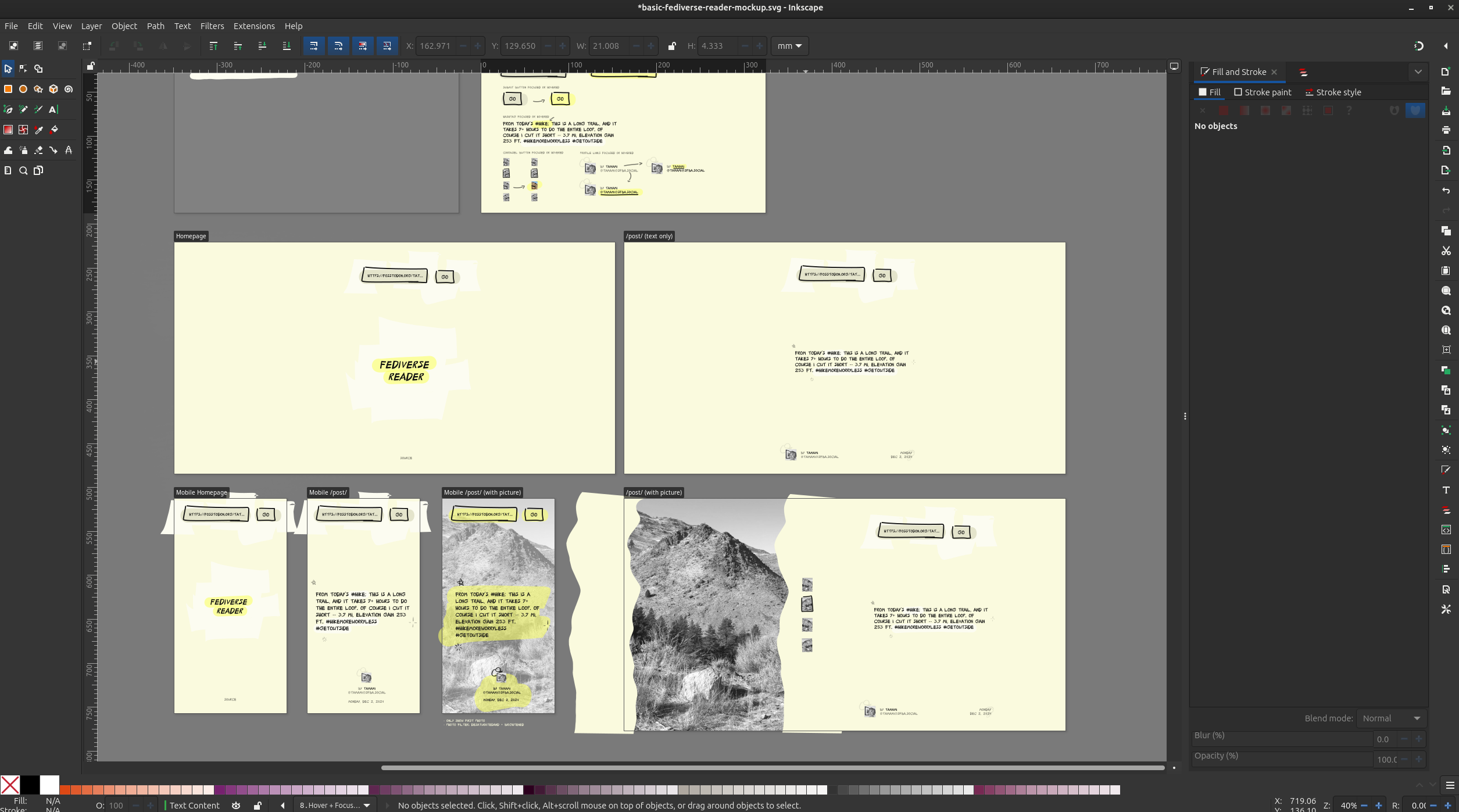
Inkscape design of the app with mobile and desktop layouts. Everything is rather beige with occasional yellow highlights. The app uses a black and white filter on any photos in the post.
Designing in Inkscape for a Web App?
Yes, Inkscape. While dedicated web design tools are common, Inkscape is effective for prototyping. You can draw and iterate quickly, then recreate shapes in code.
Trial-and-error in React is time-consuming, so polished designs saved time. It kept me motivated and provided direction, even with complex SVG paths in code.
A closeup of the toot text where you can hover the hashtags to see a yellow highlight, like a yellow highlighter. Drag selecting text also highlights text, though it's just yellow and doesn't have the marker shape to it.
SVG Paths for Style
The highlight and link backgrounds utilize SVG paths, making it easy to control path lengths and create subtle animations. These animations include highlights that "underline" hashtags or links.
I also experimented with animated clouds, where each blob is a separate path, adding a playful touch. This whimsical design element distinguishes it from a standard "just text and links" interface.
Hovering the author username shows a nice little cloud pop in and below that the full username is displayed. The author avatar is also shown in sepia.
Considering Other Tools
I considered using Penpot (a FOSS alternative to Figma) but faced stability issues and limited VM resources. Inkscape's stability and drawing tools were more reliable for now, though Penpot remains a future option as it develops further.
Code and Availability
This project was a learning experience rather than a polished final product. In the spirit of open-source, all the code is available here:
The code is on GitHub (opens in a new window)
Wrapping It Up
This Fediverse reader was a quick experiment to learn Fedify and ActivityPub, and to iterate on designs in Inkscape. It's not perfect but serves as a working example for exploring the Fediverse without full social interaction. Give it a try and share your thoughts!
Try it out at fediverse.hayes.software (opens in a new window)